Note: You are on the beta version of our docs. This is a work in progress and may contain broken links and pages.
UI
Button
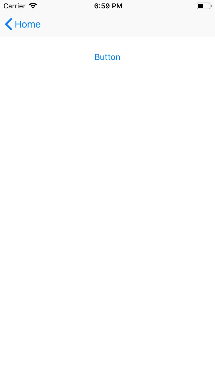
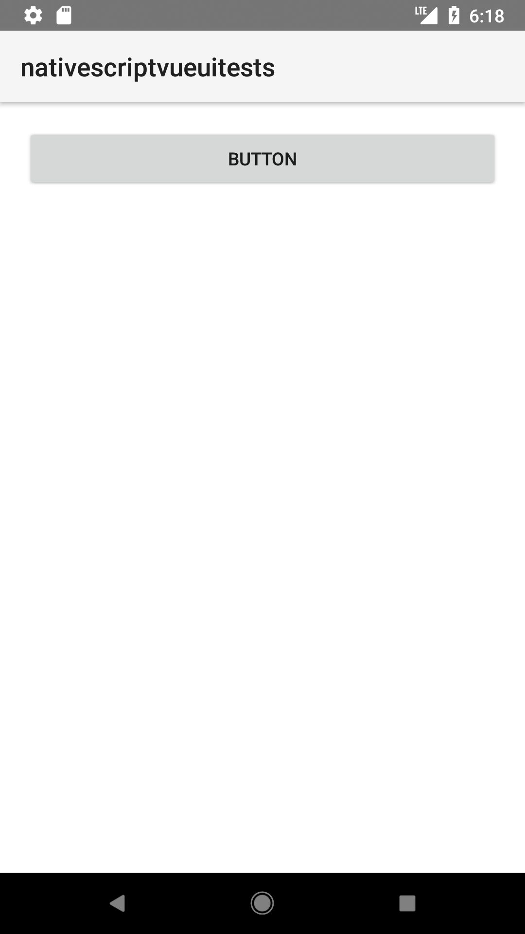
<Button> is a UI component that displays a button which reacts to a user gesture.
For more information about the available gestures, see Gestures.


xml
<Button text="Tap me!" tap="onTap" />
ts
import { Button } from '@nativescript/core'

export function onTap(args) {
  const button = args.object as Button
  // execute your custom logic here...
}
Styling the button
If you need to style parts of the text, you can use a combination of a FormattedString and Span elements.
xml
<button>
  <FormattedString>
    <span text="This text has a " />
    <span text="red " style="color: red" />
    <span text="piece of text. " />
    <span text="Also, this bit is italic, " fontStyle="italic" />
    <span text="and this bit is bold." fontWeight="bold" />
  </FormattedString>
</button>
Props
text
xml
<Button text="Tap me!"/>
Sets the label of the button.
textWrap
xml
<Button text="Tap me!" textWrap="true" />
Gets or sets whether the widget wraps the text of the label. Useful for longer labels. Default value is false.
isEnabled
ts
button.isEnabled = false
Make the button disabled or enabled. A disabled button is unusable and un-clickable. Default value is true.
Inherited
For additional inherited properties, refer to the API Reference.
Event(s)
tap
xml
<Button text="Tap me!" tap="{{ onTap }}" />
ts
export class HelloWorldModel extends Observable {
  onTap(args: EventData) {}
}
Emitted when the button is tapped. Event type is EventData
Native component
| Android | iOS |
|---|---|
android.widget.Button | UIButton |
- Previous
- ActivityIndicator
- Next
- DatePicker


