UI
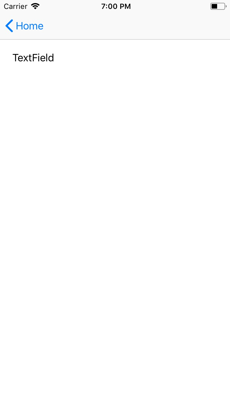
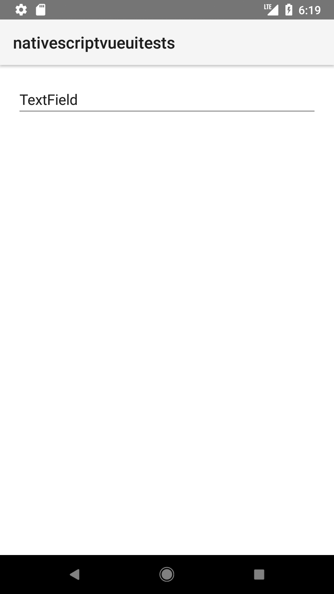
TextField
<TextField> is an input component that creates an editable single-line box.
<TextField> extends TextBase and EditableTextBase which provide additional properties and events.


Creating a simple TextField
Below is a simple TextField component listening to a user input change event.
<TextField
  hint="Your first name"
  text="{{ firstName }}"
  textChange="{{ onFirstNameChange }}"
/>
  onFirstNameChange(args: PropertyChangeData) {
    console.log(args.value)
  }
Styling
The following example shows a TextField styled with @nativescript/tailwind.
 <TextField hint="Your first name"
    text="{{ firstName }}"
    textChange="{{ onFirstNameChange }}"
    class="border border-gray-500 rounded-lg pl-2 text-gray-700"/>
Props
text
<TextView text="{{ viewDate }}" />
text: string = textField.text
Gets or sets the text value of the component.
hint
<TextView hint="hint" />
hint: string = textField.hint
Gets or sets the placeholder text for the component.
editable
<TextView editable="false" />
editable: boolean = textField.editable
//or
textField.editable = false
Toggles the ability to take user input.
keyboardType
<TextView keyboardType="number" />
textField.keyboardType = CoreTypes.KeyboardType.number
//or
keyboardType: CoreTypes.KeyboardType = textField.keyboardType
Shows the appropriate keyboard keys for the data the TextField will capture. See CoreTypes.KeyboardType for available values.
returnKeyType
<TextView returnKeyType="next" />
textField.returnKeyType = CoreTypes.ReturnKeyType.next
//or
returnKeyType: CoreTypes.ReturnKeyType = textField.returnKeyType
Gets or sets the label of the return key. See CoreTypes.ReturnKeyType for available values.
isEnabled
Allows or disallow the field to be editted. Default value is true.
maxLength
<TextView maxLength="10" />
textView.maxLength = 10
Limits input to the specified number of characters.
secure
<TextView secure="true" />
Hides the entered text when true. Use this property for password input fields. Default value: false.
secureWithoutAutofill
(iOS-only) Prevents iOS 12+ auto suggested strong password handling.
autocapitalizationType
<TextField text="Hello" autocapitalizationType="words" />
Gets or sets the autocapitalization type. See AutocapitalizationType interface for valid options.
letterSpacing
<TextField text="Hello" letterSpacing="4" />
Gets or sets letter space style property.
textAlignment
<TextView textAlignment="center" />
Gets or sets the text alignment. See TextAlignment for valid options.
textDecoration
Gets or sets the text decoration. See TextDecoration for valid options.
textTransform
<TextField hint="" text="Hello" textTransform="uppercase">
Gets or sets the text transform. See TextTransform for valid options.
whiteSpace
Gets or sets white space style property. See WhiteSpace for valid options.
...Inherited
For additional inherited properties, refer to the API Reference.
Methods
focus()
isFieldFocused: boolean = textField.focus()
Focuses the TextField and returns true if the focus is succeessful.
dismissSoftInput()
textField.dismissSoftInput()
Hides the keyboard on the screen.
Events
textChange
Emitted when the input value text changes. Event data type: PropertyChangeData
returnPress
Emitted when the return key is pressed. Event data type: EventData
focus
Emitted when the field is in focus. Event data type: EventData
blur
Emitted when the field loses focus. Event data type: EventData
Native component
| Android | iOS |
|---|---|
android.widget.EditText | UITextField |


