UI
TextView
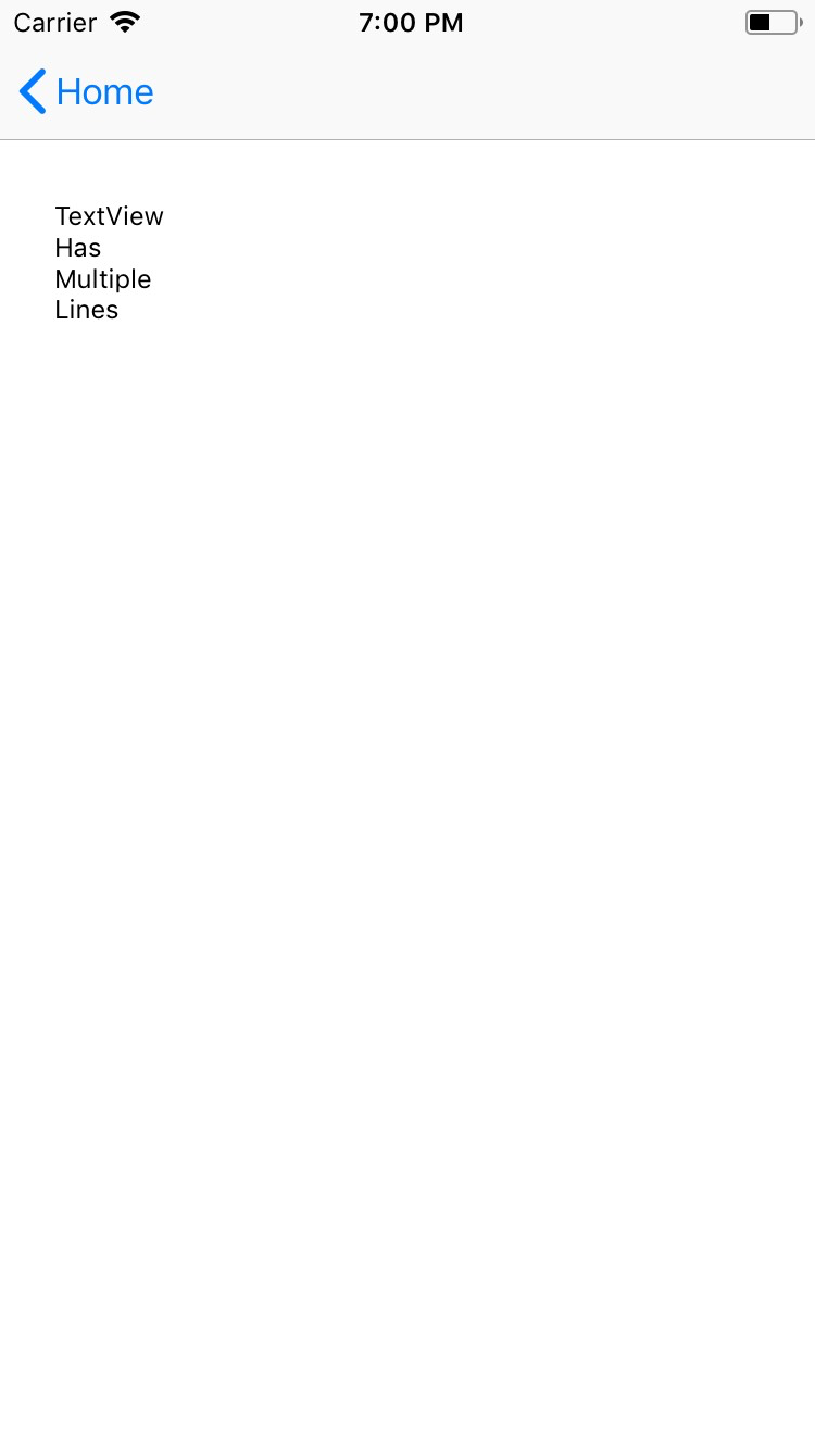
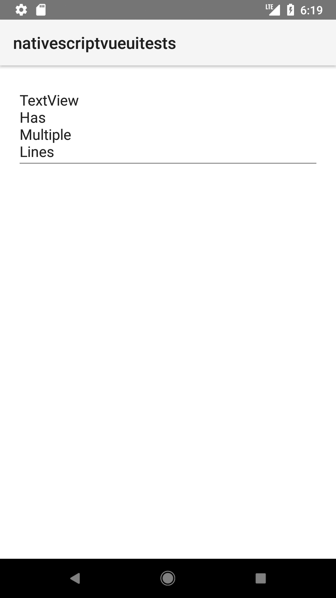
<TextView> is a UI component that shows an editable or a read-only multi-line text container. You can use it to let users type large text in your app or to show longer, multi-line text on the screen.
<TextView> extends TextBase and EditableTextBase which provide additional properties and events.


<TextView
  loaded="onTextViewLoaded"
  hint="Enter Date"
  text="{{ viewDate }}"
  secure="false"
  keyboardType="datetime"
  returnKeyType="done"
  autocorrect="false"
  maxLength="10"
/>
import { Observable, Page, TextView } from '@nativescript/core'

export function onNavigatingTo(args) {
  const page = args.object as Page
  const vm = new Observable()
  vm.set('viewDate', '')
  page.bindingContext = vm
}
export function onTextViewLoaded(argsloaded) {
  const textView = argsloaded.object as TextView
  textView.on('focus', (args) => {
    const view = args.object as TextView
    console.log('On TextView focus')
  })
  textView.on('blur', (args) => {
    const view = args.object as TextView
    console.log('On TextView blur')
  })
}
Displaying multi-style text
To apply multiple styles to the text in your <TextView>, you can use <FormattedString>
<TextView editable="false">
  <FormattedString>
    <span text="You can use text attributes such as " />
    <span text="bold, " fontWeight="Bold" />
    <span text="italic " fontStyle="Italic" />
    <span text="and " />
    <span text="underline." textDecoration="Underline" />
  </FormattedString>
</TextView>
Props
text
<TextView text="{{ viewDate }}" />
text: string = textView.text
Gets or sets the text value of the component.
hint
<TextView hint="hint" />
hint: string = textView.hint
Gets or sets the placeholder text for the component.
editable
<TextView editable="false" />
editable: boolean = textView.editable
//or
textView.editable = false
Toggles the ability to take user input.
keyboardType
<TextView keyboardType="number" />
textView.keyboardType = CoreTypes.KeyboardType.number
//or
keyboardType: CoreTypes.KeyboardType = textView.keyboardType
Shows the appropriate keyboard keys for the data the TextField will capture. See CoreTypes.KeyboardType for available values.
returnKeyType
<TextView returnKeyType="next" />
textView.returnKeyType = CoreTypes.ReturnKeyType.next
//or
returnKeyType: CoreTypes.ReturnKeyType = textView.returnKeyType
Gets or sets the label of the return key. See CoreTypes.ReturnKeyType for available values.
maxLines
<TextView maxLines="2" />
textView.maxLines = 2
Limits input to a certain number of lines.
autocorrect
<TextView returnKeyType="autocorrect" />
textView.autocorrect = true
//or
autocorrect: boolean = textView.autocorrect
Enables or disables autocorrect.
...Inherited
For additional inherited properties not shown, refer to the API Reference.
Events
| Name | Description |
|---|---|
textChange | Emitted when the text changes. Event data type: PropertyChangeData |
returnPress | Emitted when the return key is pressed. Event data type: EventData |
focus | Emitted when the field is in focus. Event data type: EventData |
blur | Emitted when the field loses focus. Event data type: EventData |
Native component
| Android | iOS |
|---|---|
android.widget.EditText | UITextView |
- Previous
- TextField
- Next
- TimePicker


